Zaha Hadid’s Riverside Museum

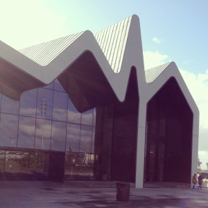
Last week I visited the Riverside Museum in Glasgow that was designed by Zaha Hadid and is Scotland’s Museum of Transport and Travel. The building is in full harmony with its industrial, urban context and although it only opened for the public about a year ago, it looks like it has been there for a long time.

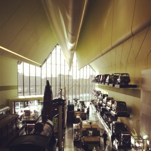
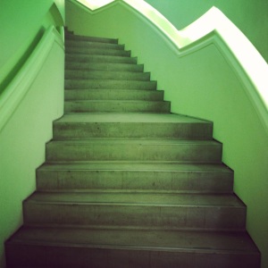
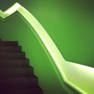
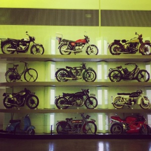
Most of the interior surfaces are painted in a bright lime colour, which was a very brave choice for an exhibition space but somehow it works because it truly highlights the exhibits and gives the interior a lot of character. There is a lot of natural light entering the interior space from both glazed ends of the building and the  smaller glass openings, which are strategically placed around the envelop in order to frame some amazing views of the Clyde and of the city of Glasgow.

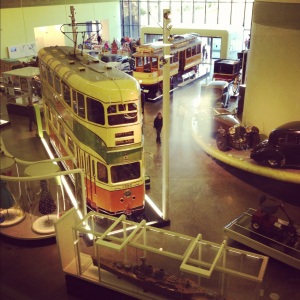
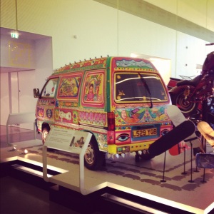
The interior space is rather overwhelming at first because there are too many large scale exhibits in an open plan space but once you starting moving around and focus on particular exhibits you’ll start ignoring your peripheral vision. There is an area inside the museum that has been transformed to look like a street from the early 20th century. It certainly feels like a time travelling experience to be in a Zaha Hadid, contemporary architecture building but at the same time walk around a street from the last century.

The sleek signage graphics, which were designed by Marque, have a dotted theme that works very well with the building as it matches the textured “dotted” interior wall surfaces.

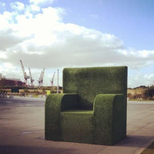
I would definitely recommend a visit, especially with your little ones as there were a lot of excited children around, who seemed to enjoy themselves both inside the museum and outside where there was some huge grass furniture to climb on as well as an ice cream van…

The exterior

Zaha Hadid_Riverside_1    Zaha Hadid_Riverside_2

Zaha Hadid_Riverside_4    Zaha Hadid_Riverside_3

The interior

Zaha Hadid_Riverside_5    Zaha Hadid_Riverside_6

Zaha Hadid_Riverside_7    Zaha Hadid_Riverside_8

Zaha Hadid_Riverside_11    Zaha Hadid_Riverside _10

The exhibits

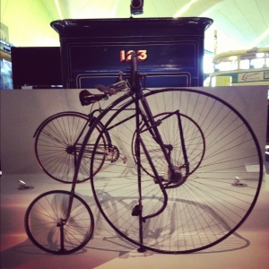
Zaha Hadid_Riverside_12    Zaha Hadid_Riverside_13

Zaha Hadid_Riverside_15    Zaha Hadid_Riverside_14

Zaha Hadid_Riverside_16    Zaha Hadid_Riverside_17

Zaha Hadid_Riverside_18    Zaha Hadid_Riverside_19

The graphics

Zaha Hadid_Riverside_21    Zaha Hadid_Riverside_20

Zaha Hadid_Riveriside_23    Zaha Hadid_Riveriside_22

Grayson Perry Tapestries

The Annunciation of the Virgin Deal, 2012, detail (image via: anothermag)

If you missed Grayson Perry’s The Vanity of Small Differences exhibition, which was on at the Victoria Miro gallery then I strongly recommend that you visit the William Morris Gallery in north-east London, which will be exhibiting Perry’s Walthamstow Tapestry until 30 September. This large scale (3m x 15m) tapestry explores the impact of branding and advertising on our everyday lives so its theme is similar to the newer tapestries of the Victoria Miro exhibition.

If it is not possible to visit the exhibition or if you want to watch something really interesting and thought provoking then I suggest watching Grayson Perry’s documentary called All In The Best Possible Taste, which aired recently on UK’s Channel 4. The three-part documentary explores how the working, middle and upper classes have developed their sense of taste and how Perry created the six tapestries (two for each social class) for The Vanity of Small Differences exhibition.

It is rather rare for artists to reveal so much information about the creative process behind their work so having the opportunity to watch a TV series where the intentions of the artist have been so well documented is truly unique.

Grayson’s statement that “nothing has such a strong influence on our aesthetic taste as the social class we grow up in” is proven to be quite accurate as he travels through Britain and meets people of different social classes. In the first episode he travels to Sutherland to examine working class taste. In the second episode he goes to Kings Hill, a new development of executive housing in Kent to delve into the taste of middle class and finally in the last part of the series he travels to Cotswolds in Gloucestershire to investigate upper class taste.

Perry’s approach to the sensitive subjects of class and taste is just outstanding and his observations are truly profound. The questions he asks throughout the TV series are so perceptive and manage to retrieve such indicative answers that one has to recognize Grayson’s talent and intuition as a presenter.

A lot of the characters and objects that were encountered whilst filming the documentary are portrayed on the tapestries. The process that Perry followed to create his tapestries involved digitally designing them using Photoshop and then sending them to Flanders to be woven on a computer-controlled loom. Perry said that he chose the medium of tapestry because he enjoys “the idea of using this costly and ancient medium to show the commonplace dramas of modern British life”.

The six tapestries tell a story of class mobility embodied in the character of Tim Rakewell -a clear reference to William Hogarth’s “A Rake’s Progress”, which is a series of eight paintings that tell the story of Tom Rakewell: a young man who inherits a fortune from his father, misspends it, marries for money, goes to prison and finally dies in a madhouse. As Perry explained in the documentary, another influence for the tapestries derives from early renaissance painting, which is his “favourite form of art”. Moreover, his tapestries “to a greater or lesser extent, pay homage to a religious work”.

There are not many TV shows about art so the fact that a documentary on the research and process behind an artist’s work makes it to prime time national TV should give you a hint of Grayson Perry’s genius.

Here are the tapestries:

The Adoration of the Cage Fighters, 2012 (image via: factum-arte)

The Agony in the Car Park, 2012 (image via: factum-arte)

The Expulsion from Number Eight Eden Close, 2012 (image via: factum-arte)

The Annunciation of the Virgin Deal, 2012 (image via: factum-arte)

The Upper Class at Bay, 2012 (image via: factum-arte)

#Lamentation, 2012 (image via: factum-arte)

Grayson Perry in front of The Walthamstow Tapestry, 2009 (image via: trenddelacreme)

On Your Marks

Stadium Vs Orbit II (triptych), 2012

London-based graphic artist, Zanny Mellor is currently presenting her first solo exhibition “On Your Marks” at the Neville Johnson’s London showroom. As London awaits the games, her new series of works focuses on the architecture and graphic language of the Olympic venues.

Mellor deconstructs and decodes the Olympic stadium, the Velodrome, the Aquatics centre and the Orbit in order to depict in her canvases, their dynamism and capture the energy of the athletes who will compete in them. It is rare for paintings that are so technically flawless to transmit such strong expression but Zanny Mellor’s work is exquisitely detailed and it screams of energy, movement and dynamism.

The solo show provides a fresh perspective on Mellor’s frenetic architectural compositions and a development in style from her London Olympic Build III (2010), which was showcased at The Royal Academy’s Summer Exhibition in 2011.

I have had the privilege to meet Zanny Mellor in person last week at her studio, where we had a very interesting conversation about her impressive work. The first thing I noted when I looked closely at her work was that it was all hand drawn to perfection. In fact she told me that painting the Orbit elements was so exhausting and involved such intricate masking and detailing that she had to strap her hand and have physiotherapy!

There are distinct architectural influences in Mellor’s work so when I asked her where did her interest in architecture come from she explained that what brought her to architecture was the fact that she was “always interested in trying to document movement, through various artistic means and infusing that with a fascination with maps and geography”. In fact it is not only the visible that she is interested in documenting but she also wants to visualize what we can’t see such as the constant movement of the London underground trains.”

When I told Zanny that what I find very interesting about her work is that her paintings have an intense sense of movement and colours but at the same time they have a lot of very static elements and symbols of architectural drawings she agreed that a way to describe her work would be that her paintings are like “architectural drawings on acid! They can be quite psychedelic sometimes.” 

Another interesting detail that I picked up when I was in her studio is that she paints her canvases on an architectural drafting table. The image of a canvas on a drafting table is ideal to describe Zanny Mellor’s style. She’s an “architectural painter” to look out for…

Exhibition dates: July 20th to August 11th

Neville Johnson, 3 Wigmore St, London, W1U IAD

Neville Johnson showroom hours are 10am – 6pm Mon -Sat

For an appointment to view the exhibition with the artist please email her at zannymellor@gmail.com

To find more about Zanny Mellor’s work you can visit her website: www.zannymellor.com

Velodrome I, 2012

Stadium Vs Orbit, 2012

On Your Marks, 2012